Jump to:
Though much of our recent work (devices, apps, services) is under NDA, we can share the following examples to show the breadth and depth of our experience and outline how we helped our clients:
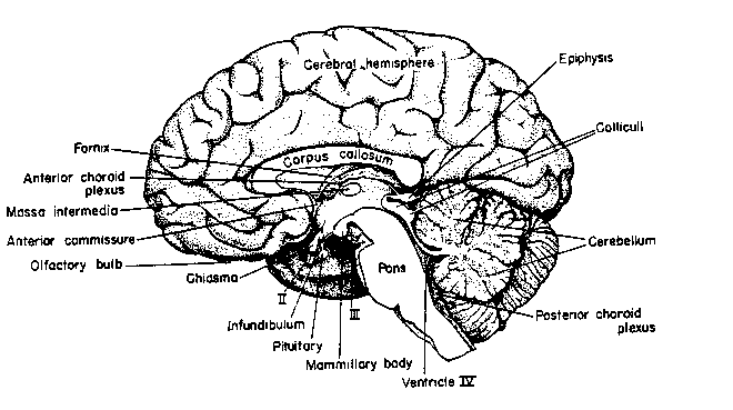
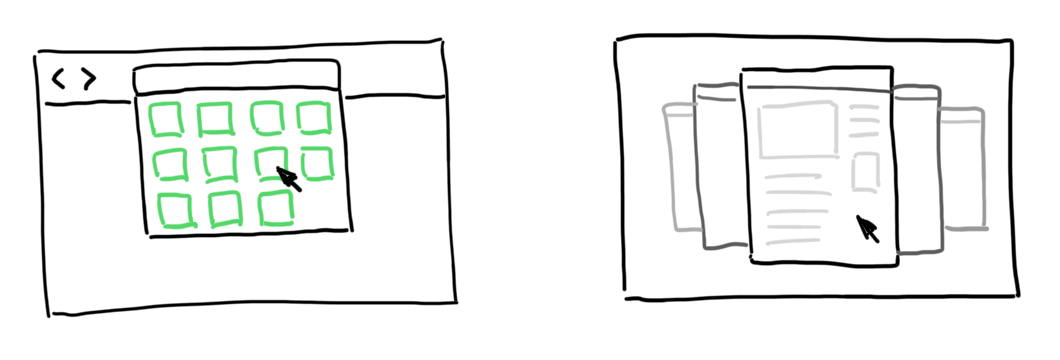
Convertible Smartphone
UX team lead, Concepts, Research, Developer support
Dock this smartphone and it becomes a desktop computer. Make phone calls, play music, use apps while using browsing the web, edit spreadsheets — all in a full-fledged multi-tasking, multi-window environment. This product was a glimpse of convertible computing devices to come (see the Nintendo Switch).
This UI was a challenge — hybrid devices have lots of edge cases. How do you make a phone call when your device is in a dock? Bryan lead the UX effort of this project for a major telecommunications product company from concept development to managing interaction design to implementation support.
This breakthrough UI won many awards and was the first iteration of everyone’s dream: your entire computer in your pocket.
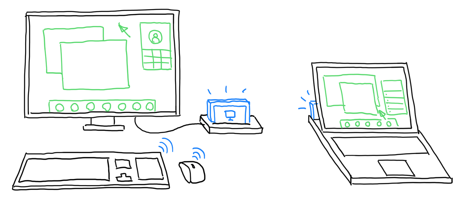
Truveon
HVAC Management / Industrial Internet of Things
UX Architect / Product Manager
Remote HVAC management and diagnosis.
Embedded with a client, our distributed design and development team (Cloud City), concepted and designed very different user experiences for managers, technicians, headless devices, and customers — all aimed at improving the efficiency and maintenance of Heating, Ventilation, and Air Conditioning systems. An efficient HVAC system means better energy efficiency and happier homeowners.
Starting with sketching out a product roadmap that extended from installation to consumers, we observed how HVAC systems are sold, built, and managed. We designed the system so that it empowers technicians rather than gets in their way.
The team learned a lot about HVAC systems (PV=nRT), efficiency, and maintenance as well as the installation and management using Internet of (Industrial) Things. Homeowner-facing controls help sell the product as well as gives insight into energy use (and helps sell homes that use the system).
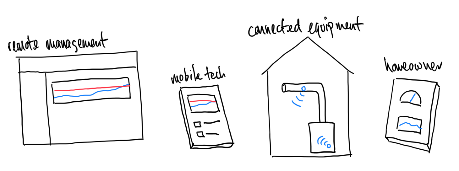
Smart TV
Concept development
Developed smart TV concepts and high-fidelity prototypes exploring apps, gaming, second-screen experiences, auto-sensing, and multitasking. Introduced high-fidelity prototyping into the design process.
Company was later acquired for its innovative smart tv work.
Web Appliance
Concept development, Design Team Lead
Bryan lead a team of designers developing concepts for a web-browser-centric information appliance.
We explored concepts with high-fidelity animated maquettes to create a unified platform focused on “physical” web browsing. Our research focused on how people manage privacy, bookmarks, clippings, and browser state between home and work contexts.
Totally coincidentally, many of our ideas for the address bar, bookmarks, and tab management showed up later in Apple’s current Safari web browser.
We love working with organizations that make our world a better place.
![[Seafood Watch Illustration]](portfolio/images/Recent/Seafoodwatch-nets.jpg)
Seafood Watch / Monterey Bay Aquarium
Communications Strategy + Site Rearchitecture
Field Research, Service Design, Communications Strategy, Website Redesign
Seafood Watch (SFW) is a program of the Monterey Bay Aquarium that educates and empowers consumers and businesses to make better choices for a healthy ocean. You may be familiar with their ubiquitous color-coded Seafood Watch wallet cards that categorizes seafood by levels of sustainability.
SFW realized that their old site needed updating but didn't know where to start. We created a research plan to find out how both consumers and business people made their buying decisions — what information they needed and in what form. Our design researcher and resident food expert, Thy Tran, started by meeting SFW staff and evaluating the current site and materials before moving on to interviewing business suppliers, buyers, executive chefs, and shoppers at the grocery store.
From this primary research we discovered critical insights into how business and consumers thought and processed information. After extensive sentiment tabulation and analysis, we created a thick report with communication strategy recommendations that fed into the current version of the Seafood Watch website and became a years-long roadmap.
This was one of our favorite projects… where our ethnographic research led directly to improvements in their approach and shaped an internal roadmap for future projects.
![[Monterey Bay Aquarium Website Screenshot]](portfolio/images/MontereyBayAquarium/mbaq-website-2019.jpg)
Monterey Bay Aquarium
Responsive Redesign and Rearchitecture
Field Research, Service Design, Communications Strategy, Website Redesign
The Monterey Bay Aquarium is a world-famous aquarium and research center and its website entices visitors from around the world, supports teaching efforts, peeks into research programs, and more.
The aquarium's website was ancient, crufty, mobile-unfriendly, and needed an update. They asked us to help create a responsive, modern site that addressed their contemporary user expectations, supporting a wide variety of user journeys: vacation visitor (and pre-visitor) research and planning, teachers planning field trips, donations and membership, among others.
We researched how modern users searched for and used information about the aquarium via interviews, intercepts, and lab studies. We learned how people planned their visits (often around specific animals), what was important to them pre-visit (hotels), during their visit (sharing photos), and post-visit (education). We also discovered what donors wanted to see, what members expected. And not surprisingly, how users of all types did all these things on their smartphones.
This research fed into a new site architecture, culling parts of the site that were no longer relevant, and enhancing or building new sections that helped website visitors with their specific goals.
One of our favorite projects, we worked with a talented and motivated internal design team, creating the new, more helpful architecture that you can see today.
![[Citation history screenshot]](portfolio/images/PLOS-citation-timeline.png)
PLoS Labs
Exposing the hidden connections in citations
User Research, Information Design, Prototyping
The Public Library of Science is a non-profit journal publisher (PLoS One) and advocate dedicated open (free) access to scientific research for everyone around the world, not just those who can afford the exorbitant journal subscription fees. Towards that mission of accessibility, Bryan worked with the PLoS Labs team to improve how citations in scientific papers are used by academics and researchers and how to make these papers more readable and useful on the web.
Backgrounder: Surprisingly, even though the web was originally designed for sharing research, citations in scientific papers are locked in antiquated plaintext: there are no hyperlinks between papers! By using automated machine recognition, researchers at PLoS were able to create these hyperlinks, even if they were between journals. But what more could we do? What information can an expert glean from a paper's list of citations?
By conducting many interviews with grad students, researchers, and reporters, we found that experienced readers looked for patterns such as self-citations, clustered dates, cited papers that were retracted, interwoven publications by an affiliated group, and more. We then built an interface that exposed these citations in context (rather than requiring the user to scroll to the bottom of a page and back) and enabled visualizations of patterns in the citations and in the paper itself. We were also able to identify free-to-read "open access" papers upfront, reducing the friction in scientific research.
This was a small but very enjoyable project because we like it when humanity gets smarter!
Learn more : PLoS Rich Citations